Mason Wave
Mason Wave started as an assignment that I received for a job interview. I was merely given the name and told to develop a brand identity for whatever I thought of first. In the beginning, it was a surf shop, strictly due to the Wave portion of the name, but then I realized I had the opportunity to pick a field I was passionate about, so I chose Interior design.
My Roles & Responsibilities
-
UX Designer
-
Visual Designer
-
Information Architect
-
Primary and secondary research
-
Organized and structured the information in the website to streamline the user experience
-
Designed the initial and refined visual components of the website and branding
-
Creating style guides
-
Low-fidelity wireframes and prototypes
-
High-fidelity designs and asset creation
Ideation
I knew with a name like Mason Wave, it had to be coastal, airy, light, and crisp. This lead me to think that the key market should be beach houses. Then my marketing brain kicked in, and I realized that beach homes were too small of a market, but Mason Wave could keep its design ascetic to a minimalist, beachy, clean feel. The keywords then became:
Comfortable
Calming
Modern
Clean
Sophisticated
Fluid
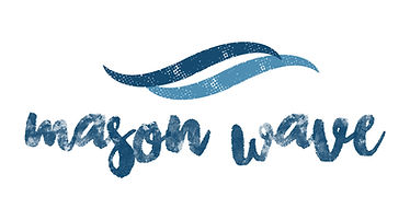
Logo Creation
I was inspired to try and find a script font that would make the W and the M to look like the reverse of one another. These letters would mimic some of the "icons as part of the logo" choices I choose on Pinterest. I was also inspired to use a classic serif font to highlight the sophistication and luxury of the brand. Next, I knew that I wanted an icon as well for when I had to transition the logo into a favicon, badge, and alternative logo.
All logos involve something revolving around the wave and water theme. The top two concepts were in the direction I wanted. Instead of trying to choose one, I combined them to get the watercolor texture font as well as the soft wave and even managed to get the watercolor texture in the wave as well; that was a big win for me!

Logo Drafts
Final Logo
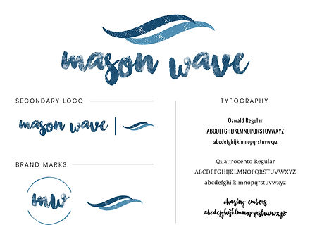
Brand Folio
All of my projects also include a brand folio which houses all of the information relevant to the company and its brand. From the brand color, logos, fonts, and more.

Collateral
For the business card, I kept it really simple and clean in order to let the logo shine.
As my second launch file, I chose an email. This design can easily be spliced (PhotoShop tool) and sent as one long email with multiple parts of the email linking to different pages in the website, with a multitude of email platforms, MailChimp, Constant Contact, and Higher Logic, to name a few.
I wanted to highlight all of the services that Mason Wave had to offer. I made sure to use the dark colors of the palette to create some depth in the email and draw the users’ attention to the primary services Mason Wave provides.


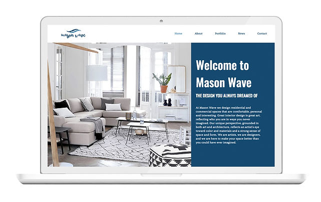
Website
The goal of the website design was to use the same color blocking as we did for the email and highlight the fantastic interiors that MW would have done if it were real! (redo the projects page to match the sketch I created) All of the images are of light, clean interiors that match MW brand goals. I wanted to make sure that you could quickly go from checking out their work to making an appointment for a consultation.